Color psychology is one of the most over-claimed fields in design.
You’ve seen the headlines: “Blue makes you smarter.” “Red increases appetite.” “Yellow rooms make babies cry.” Most of these claims rest on thin or misinterpreted research, oversimplifying what color actually does. The marketing of color psychology has confidently outpaced what the evidence actually supports.
That said: there is a real psychology of color. It’s quieter, more conditional, and more interesting than the headlines suggest. Color genuinely does affect how rooms feel — but the effects depend heavily on context, culture, intensity, lighting, and the individual person. Understanding what the research actually supports lets you use color thoughtfully without falling for the magazine-version oversimplifications.
This post is a careful look at what color does in home decor, what the evidence supports, and how to use color in your home with realistic expectations.
What the Research Actually Shows
Let me start with a careful frame: most popular claims about color psychology come from either small studies, marketing-funded research, or cultural assumptions presented as biological facts. The actual research is more careful and more limited.
What seems to be reasonably well-supported:
Color has measurable physiological effects in some contexts. Bright red light has been shown to slightly increase heart rate and blood pressure compared to blue or green light, especially in contexts where it dominates the visual field. The effects are real but small.
Color affects perceived temperature. Rooms painted in “cool” colors (blues, greens, purples) are perceived as cooler than rooms in “warm” colors (reds, oranges, yellows) at the same actual temperature. The effect is small but consistent.
Color affects perceived spatial dimensions. Light colors make rooms appear larger and ceilings higher; dark colors make rooms feel smaller and more intimate. This is a robust visual effect.
Color affects mood and arousal — but contextually. High-saturation bright colors tend to increase arousal; muted, low-saturation colors tend to decrease it. But the effect depends heavily on the specific person, the room context, and what other colors are present.
Color preferences are highly individual and culturally specific. Generalizations about “what color does to people” mask huge individual variation. The same blue that calms one person can feel sterile and cold to another.
What is not well-supported:
- Specific claims like “yellow walls cause anger” or “blue rooms reduce blood pressure”
- The idea that there’s a single “best” color for any room or activity
- The strong version of color symbolism (where each color has a fixed psychological meaning)
- Most of the specific claims popular in real estate marketing
The honest summary: color does meaningfully affect how rooms feel, but the effects are subtler and more contextual than the popular literature suggests.
With that frame, here are the principles that actually hold up.
Principle 1: Saturation Matters More Than Hue
The single most important fact about color in home decor: saturation (how intense a color is) matters more than hue (which color it is).
A muted dusty blue and a muted dusty rose feel similarly calm; a saturated electric blue and a saturated bright pink feel similarly stimulating. The saturation level — how vivid the color is — has a much larger effect on how a room feels than the specific color does.
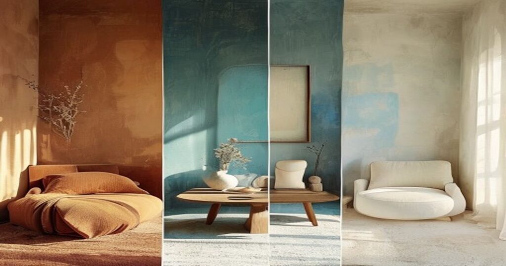
For most home contexts, low-to-medium saturation colors create calmer, more livable rooms. High-saturation colors are best used as small accents, not as dominant tones.
This is why many of the most beloved interior color palettes are restrained. Pale blues, dusty greens, warm whites, deep browns, soft terracottas, muted ochres. None of them are intensely saturated. All of them are easy to live with for years.
Principle 2: Color Temperature Matters as Much as Color
Within any color, warm versions (those with more yellow or red undertones) feel different from cool versions (those with more blue undertones). Even a “white” room can feel warm or cool depending on whether the white has yellow or blue undertones.
For the rooms where you spend most relaxation time (living room, bedroom, dining room), warm undertones generally feel more inviting. For rooms where you want a sense of cleanliness and clarity (bathrooms, kitchens, modern offices), cool undertones can work well.
The mistake to avoid: pairing warm and cool tones together without intention. A warm beige sofa against a cool gray wall can feel slightly off in a way that’s hard to name. The whole palette of a room should be in temperature alignment.
Principle 3: Light Changes Color Drastically
The same paint color looks dramatically different under different lighting conditions. A cool gray that looks sophisticated under daylight can look cold and lifeless under warm-bulb evening light. A warm cream that glows under sunset light can look almost yellow under cool office lighting.
Always test paint colors in the actual room you’ll paint, under the actual lighting conditions you’ll have, at multiple times of day. Many regrettable paint choices come from picking a color from a swatch in a hardware store under fluorescent light, then living with the color under home conditions where it looks completely different.
This is why it’s worth getting paint samples and painting larger swatches (1m x 1m or so) on different walls of the room before committing.
Principle 4: The Whole Room Is the Color, Not Just the Walls
Most color discussions focus on wall paint as if it were the dominant visual element. In reality, the color of a room is the sum of all its visible surfaces — walls, floors, ceilings, furniture, textiles, art, plants, decor objects.
A neutral-walled room with rich-colored furniture is, visually, a colored room. A vivid-walled room with neutral furniture might be visually quieter than you’d expect. The dominant color of the room is whatever fills the most of your visual field, which may or may not be the wall paint.
When designing a room, think about the overall palette — the combined effect of all surfaces — rather than just the wall color in isolation.
Principle 5: Restraint Beats Variety
Most great rooms have a restrained color palette. Three to five distinct colors total, with one or two dominating and the others as accents.
The typical mistake: too many colors competing. A blue rug, green pillows, purple art, orange throw, yellow vase — all in one room. The visual chaos drains the calmness from a space.
A better approach: pick a small palette and stick to it. A muted green, a warm cream, a soft brown, a single deeper accent. Repeat these colors in different elements throughout the room. The repetition creates coherence; the limited palette creates rest.
Principle 6: Natural Colors Are More Forgiving
Colors derived from nature — earth tones, plant greens, sky blues, sand tans, stone grays — tend to be more livable in homes than synthesized colors that don’t appear in natural environments.
The hypothesis: human visual systems evolved in natural environments and are tuned to find natural color palettes harmonious. Synthetic colors (neon greens, electric purples, fluorescent oranges) feel jarring partly because they’re outside this evolutionary visual diet.
For long-term living, lean toward color palettes that could exist in a forest, a desert, a beach, or a meadow. They tend to age well and continue to feel right years after the trend that originally made them popular has passed.
Practical Color Recommendations by Room
With the principles in place, here are some practical recommendations.
Living Rooms
Most lived-in space; should support both daily relaxation and social gathering. Best palettes are muted, warm, and varied within a tight range. Warm whites, soft beiges, muted greens, dusty blues, warm grays. One slightly deeper accent (a navy, a forest green, a deep terracotta) for visual depth.
Avoid: high-saturation primary colors as dominants, stark white-and-black contrasts (feel cold for daily living), cool gray dominants without warm balancing elements.
Bedrooms
Should support sleep. Best palettes are very low-saturation, warm, and quiet. Soft warm whites, muted greens, pale blue-grays, dusty pinks, warm taupes. The bedroom is the room where saturation should be lowest.
Avoid: bright reds and oranges (too arousing for sleep), saturated cool blues (can feel cold and sterile), high-contrast color combinations.
Kitchens
Function-heavy rooms; should feel clean, bright, and energizing without being harsh. Best palettes are light, warm, and natural. Warm whites, soft creams, light woods, muted greens, soft blues.
Cool palettes can work in modern kitchens but tend to feel more clinical. If using cool tones, balance with warm-toned wood or brass elements.
Bathrooms
The room where many people enjoy slightly different palettes. Light cool palettes (soft blues, pale greens, crisp whites) feel clean and spa-like. Deep, dramatic palettes (charcoal, deep teal, dark green) can make small bathrooms feel intimate and luxurious.
Either approach works; mixing partial cool and warm in a bathroom rarely does.
Home Offices
Should support focus without being sterile. Best palettes are medium-saturation, calm, and slightly stimulating. Muted blues and greens (associated with focus), warm whites, soft browns, deeper accent walls if you want one.
Avoid: very dim colors (can feel oppressive over an 8-hour workday), high-stimulation palettes (interfere with focus), pure white minimalism (feels cold and institutional).
Specific Color Notes
A few notes on specific colors that come up often in home decor.
White. Not actually a single color — there are dozens of useful whites. Warm whites (with yellow or pink undertones) feel inviting; cool whites (with blue undertones) feel modern and slightly cold. For most homes, a warm off-white is more livable than pure white or cool white.
Gray. Has been over-applied in the last decade. Cool grays without warm balancing elements often produce cold, lifeless rooms. If using gray, balance with warm-toned wood, brass, or warm textiles.
Beige. Recovered its reputation; the warm muted neutrals are deeply forgiving. Modern interpretations (warm beiges, mushroom tones, putties) work in most rooms.
Green. One of the most universally well-tolerated colors for interior spaces. Sage greens, olive greens, forest greens — almost any muted green works in almost any room. Strongly associated with calm and naturalness.
Blue. Highly variable. Cool blues can feel cold; warmer slate blues feel sophisticated. Always test in your room under your light.
Black and dark colors. Used as a small accent (one wall, a piece of furniture, a frame), black adds depth and sophistication. Used as dominant, requires careful design to avoid feeling oppressive.
The Underlying Truth
Here’s the deeper claim about color in home decor.
Color is real. It does shape how rooms feel. But the effects are contextual, subtle, and individual. The popular versions of color psychology promise more than the science delivers — there’s no magic color that will solve your stress or make you smarter or boost your productivity by being on your walls.
What works is thoughtful application: restrained palettes, attention to saturation and temperature, awareness of light, alignment of all the colored surfaces in a room. None of this is dramatic. All of it produces rooms that feel right over the long arc of living in them.
The real psychology of color isn’t about each color’s mystical properties. It’s about how coherent palettes create coherent rooms that the nervous system finds easier to be in. When you get the palette right, the room just feels right — and you stop noticing the color, because it’s doing its job quietly.
That’s the goal. Color you stop noticing because it’s working.
This essay was written by Vee Sharma, founder of Moving Sandscape. Our deep-sea sandscape is a hand-finished kinetic sand piece designed for the kind of slow, daily attention this blog is largely about.