Choosing the right size of moving sand art for a wall is the single most common question we receive from customers who have never bought kinetic art before. The honest truth is that most people buy a size too small on their first attempt, because framed art online always looks bigger in the photographs than it looks on the wall. A desk-sized piece that reads like a hero object in a product image can disappear on a nine-foot living room wall. Getting the sizing right is the difference between a piece that anchors a room and one that gets absorbed into the background.
This guide walks through the actual math (which is not complicated), the proportions that interior designers use when choosing scale, and the specific measurements across our current frame sizes so you can make a confident decision before ordering.
The core sizing rule: the two-thirds principle
The most reliable sizing rule for any framed art above a piece of furniture is that the art should span roughly two-thirds of the width of whatever it sits above. A piece over a sofa should be about two-thirds the width of the sofa. A piece over a sideboard should be about two-thirds the width of the sideboard. A piece over a console table should span about two-thirds of the table’s length.
For a piece of art that sits on its own wall — not above a piece of furniture — the analogous rule is that the art should occupy about two-thirds of the wall’s width if the wall is treated as a single composition, or a defined section of it if the wall is long. A nine-foot wall might read best with a piece around six feet wide (or a grouping that spans that width). A twelve-foot wall typically needs either a substantial single piece or a grouping; a small single piece in the middle reads as a postage stamp.
The two-thirds rule produces visually confident rooms. Going below two-thirds (toward one-half or one-third) tends to produce the “too small” effect. Going above two-thirds toward full-wall coverage tends to dominate the room and is harder to balance unless the rest of the furniture matches the scale.
Measuring your wall properly
Before you buy anything, measure the wall — not just the overall wall but the practical display zone. A wall often has elements that reduce the usable zone: a light switch, a thermostat, a cable outlet, the edge of a doorframe, the top of a sofa or the bottom of a crown moulding. The display zone is the largest rectangle inside those constraints.
Grab a tape measure, the roll of masking tape, and do the following three steps. Mark the left and right edges of the display zone on the wall with small pieces of tape. Mark the top and bottom of the display zone. Measure the width and height of the rectangle formed by the tape. This is your maximum display area. Any piece up to about two-thirds of this width is a confident choice; anything much smaller will look lost.
Height matters as much as width
The other sizing dimension most people underestimate is height. A piece that is wide enough horizontally but too short vertically reads as a banner rather than a piece of art. For any single framed piece, aim for a height that is at least about two-thirds of the vertical display zone as well, unless the composition is specifically landscape-oriented and designed to be wide and short.
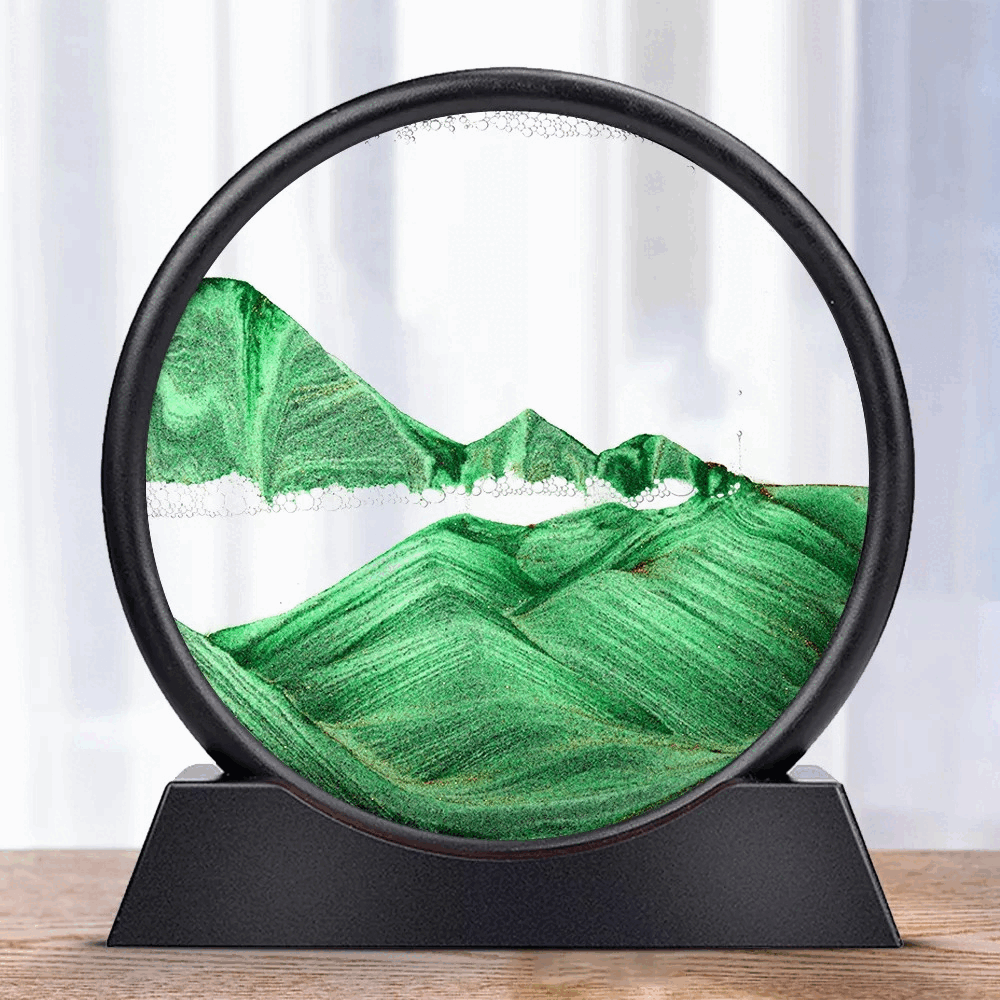
For moving sand art specifically, the best-looking formats are typically close to 3:2, 4:3, or 1:1 in width-to-height ratio. Very wide, very short formats (say 3:1 or wider) tend to lose the dramatic cascade that makes moving sand art interesting, because the sand has a shorter vertical drop.
Hanging height
Independent of the size you choose, hanging height has a large effect on how the piece reads. The museum standard is that the centre of the artwork should sit at about 1.45 to 1.55 metres (57 to 61 inches) from the floor. This is roughly eye level for the average standing adult.
When the art sits above furniture — a sofa, a console, a bed headboard — adjust down from that standard so the bottom of the art sits about 15 to 25 centimetres (6 to 10 inches) above the top of the furniture. This keeps the two objects visually connected without the art appearing to float above the piece below it.
Most hanging mistakes are hanging too high. If your instinct says “a bit higher,” the instinct is almost always wrong. Lower it by four centimetres and check again.
A specific guide by room type
The following sizing recommendations are starting points, not rules.
Above a sofa (typically 2 to 3 metres wide). Aim for a piece 120 to 180 cm wide. Our larger landscape-mountain formats (approximately 100 x 70 cm and larger) sit naturally here. A single desk-sized piece will read as too small above a full-sized sofa.
Above a console or entryway table (typically 90 to 150 cm wide). Aim for a piece 60 to 100 cm wide. Our medium landscape format is the standard choice for this location. This is one of the few places a desk-sized piece can work, particularly in smaller entryways.
Above a bed headboard (king: 180 cm, queen: 150 cm). Aim for a piece 100 to 130 cm wide for a queen, 120 to 150 cm for a king. A moving sand art piece above a bed is one of the most flattering locations for the category; the horizontal emphasis of a wide frame pairs naturally with the horizontal line of the headboard.
In a hallway (typically 90 to 120 cm of usable width per piece). Hallways suit medium or desk-sized pieces, often in sequence. Two or three desk-sized pieces in a line along a hallway read as a gallery.
On a single feature wall in a living room (width varies). Measure the wall, aim for two-thirds of the width with a single large piece, or plan a grouping if the wall is exceptionally wide. A grouping typically works best with one larger central piece flanked by smaller elements, rather than several identical pieces.
Above a desk or workstation (typically 120 to 160 cm wide). A desk-sized or medium format is perfect here. Larger pieces above a desk can feel looming; the scale of a desk-sized piece matches the intimacy of a work area.
In a small room (under 10 square metres of floor area). Most small rooms look best with a single desk-sized or medium piece. A large landscape frame in a small room tends to dominate and compress the rest of the space.
The paper-template test
Before ordering, it is worth taking an extra ten minutes to test the size physically. Tear off a sheet of wrapping paper, brown paper, or cardboard at the exact dimensions of the piece you are considering. Tape it to the wall in the intended location and live with it for 24 hours. Look at it from every angle you will actually look at the finished art — from the sofa, from the kitchen, from the hallway as you walk past. You will know within a day whether the size is right.
If you are debating between two sizes, cut two templates and compare them on the wall. The right size is usually obvious once the templates are up.
Our current frame sizes
For quick reference, our three standard formats:
The desk-sized piece measures approximately 30 x 20 cm (12 x 8 inches) and is best for shelves, nightstands, and small walls. It reads intimately and is ideal as a gift or a travel-friendly piece.
The medium landscape measures approximately 50 x 35 cm (20 x 14 inches) and is our most versatile size. It works above console tables, on home office walls, and as a single feature piece in small and medium rooms.
The large landscape-mountain format measures approximately 100 x 70 cm (40 x 28 inches) and is our statement size. It works above sofas, above beds, and as the hero piece of a feature wall.
Custom sizes between these three are available for bespoke orders; email support for options and pricing.
When in doubt, go one size bigger
The last piece of advice is the most consistent across every customer we have worked with over the years. When a customer is torn between two adjacent sizes, the larger one is almost always the better choice. The smaller piece is “safe” but tends to feel underwhelming once it is on the wall. The larger piece is confident and earns its space. Interior design fundamentally rewards the brave choice in scale; a slightly too-big piece is a minor adjustment if it ever bothers you (it rarely does), while a slightly too-small piece tends to itch.
If you would like a sizing recommendation for a specific wall, email us a photograph of the space with a measurement, and we will reply with the format we would choose. We do this several times a week and find it helps customers avoid the “one size too small” mistake that is almost universal on first purchases.