There’s a very specific gap between the bookshelf you see in interior design magazines and the bookshelf you probably have at home.
The magazine version is composed. Books and objects and art, all with the right breathing room, colors balancing across the shelf, a faint sense of someone lives here beautifully. Your version, meanwhile, is probably doing what most shelves do: leaning books alternately left and right because your bookends never stayed up, paperbacks stuffed in horizontally on top of verticals because you ran out of space, one random object in the corner because you had nowhere else to put it.
The interesting thing is that the magazine version isn’t accomplished by having more — more books, more objects, more money. It’s accomplished by following about five simple rules that change everything. The good news: you can go from “cluttered shelf” to “genuinely beautiful, lived-in shelf” in an afternoon, using what you already own.
This post is the practical version of those rules. I’ve styled my own shelves, my friends’ shelves, and made at least four attempts at the reading wall in my own living room before I found the version that worked. Everything below is what I landed on.
The Underlying Principle
Before the rules, the principle. A good bookshelf styled for a lived-in home is trying to do three things simultaneously.
First: it houses books. Actually holds them, not as decoration — as the things you reach for and put back. The shelf must work functionally before it works aesthetically.
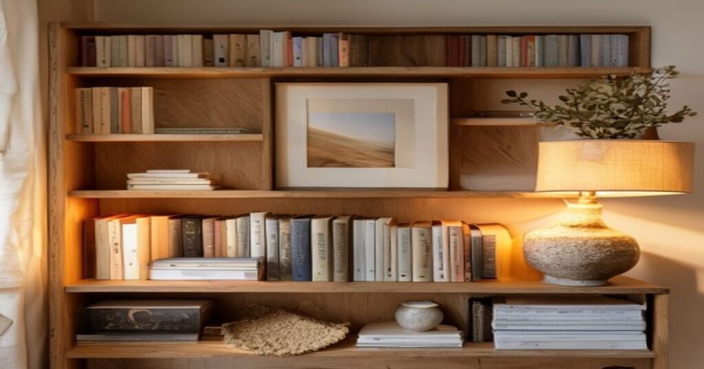
Second: it creates a layered visual landscape. Books alone, even beautiful ones, become visually flat. The interplay of book-spines with objects, with art, with framed photos, with small plants — is what produces the composed quality that styled shelves have.
Third: it shows who you are. The objects on your shelf are, whether you intended it or not, a quiet autobiography. The best-styled shelves reveal the owner’s interests, travels, history, taste — without trying to.
A shelf that nails all three is a good shelf. Most shelves nail one (usually the first) and leave the other two accidental.
The Rules That Actually Work
Rule 1: Mix horizontal and vertical book arrangements
This is the single rule that separates a styled shelf from a stacked one.
Don’t line all your books up vertically. Don’t stack them all horizontally. Alternate. Use a short vertical run (six to ten books), then a small horizontal stack (three to five books), then another vertical run.
The horizontal stacks do two useful things: they become plinths for objects (a vessel, a sculpture, a framed photograph set on top), and they break up the repetitive rhythm of vertical spines so the eye has places to rest.
Aim for roughly 60–70% vertical, 30–40% horizontal. Too much horizontal and the shelf looks like a storage warehouse. Too little and it reads as a library rather than a styled space.
Rule 2: The 60/30/10 rule for shelf contents
Over the whole shelf, think in these proportions.
- 60% books — the main content
- 30% objects — vessels, sculptures, framed photos, small plants, leaning art, small lamps
- 10% empty space — intentional negative space where the shelf is just empty
The empty space is the unintuitive part. Most people try to fill every inch. A shelf with deliberate gaps reads as confident. A shelf with every cubic inch occupied reads as anxious.
Every shelf section should have at least one small patch of negative space. Leave it empty. Trust the effect.
Rule 3: Group by color, sometimes
The “rainbow bookshelf” (books organized strictly by color) is a meme for a reason — it’s often silly, hard to navigate, and reveals nothing about the owner. But some color-grouping helps.
Two useful moves. First: cluster any loud-colored books (bright yellows, hot pinks, reds) in one or two zones rather than scattering them everywhere. A scattered cluster of loud colors makes a shelf visually chaotic; a concentrated one creates a deliberate accent. Second: break up long runs of the same color. Twenty black spines in a row is too much sameness. Slide in one or two lighter-colored books to break the monotone.
Otherwise, arrange books by subject, by author, by size, by whatever makes functional sense to you. Color should be a subtle correction, not the organizing principle.
Rule 4: Every shelf section needs one object
Not a book — an object. A vase. A sculpture. A small framed photograph. A ceramic bowl. A small kinetic piece.
This is the rule that most “book-only” shelves violate. A shelf that is purely books becomes visually monotonous no matter how beautiful the books are. You need a non-book object on every shelf section to create the layered quality that makes the shelf look styled.
Sources for shelf objects: estate sales, small potters on Instagram, vintage shops, your own travels. Avoid the “shelf styling starter kit” aesthetic — the interchangeable decorative blobs that populate mass-market home decor. Real objects with specific provenance look better than designed-for-decor objects, every time.
Rule 5: Varied heights and weights
Within each shelf section, your objects and book stacks should vary in height.
Tall vertical books, medium horizontal stack, short object on top of the stack, taller object (vessel, sculpture) beside it. The profile of the shelf, viewed from the side, should have peaks and valleys — never a flat horizon.
This is why leaning a small framed print against the back of the shelf is one of the most reliable styling moves. It adds a tall vertical element without requiring a wall. It breaks up the horizon. And it adds visual interest through overlap — you get the book + art interaction that flat shelves miss.
Rule 6: Depth, via leaning objects
Most shelves are deeper than the books need. That extra depth behind the books is a styling asset, not wasted space.
Lean things against the back wall of the shelf, behind the books. Small framed art. Postcards. A small sculptural object. The layered depth — books in front, something interesting behind — creates the looked-into quality of a well-styled shelf.
If your shelf is against a plain wall, you can even paint the inside back panel a different color — a deep charcoal or soft warm white against wood shelves — which instantly adds depth and makes whatever you lean there read as framed.
Rule 7: One slightly unexpected object per shelf
The thing that separates a beautiful shelf from a memorable shelf is one slightly unexpected item.
A small brass sculpture of an animal. A vintage camera. A tiny hand-thrown ceramic in an unusual shape. A small moving sand picture that quietly changes on its own schedule. An heirloom small object that belonged to a grandparent. A seashell. Something that breaks the design-store aesthetic.
The unexpected object is the thing that tells visitors a real human lives here with real interests. Without it, even a perfectly-styled shelf reads as if it were purchased as a set.
Rule 8: Plants small, plants few, plants alive
Plants on shelves: risky business. Too many and it becomes a greenhouse. Dead ones are worse than none. The rule of thumb: one or two small plants, spread across the shelf, easy to keep alive.
Best plants for shelves: trailing varieties (pothos, heart-leaf philodendron, string-of-pearls) that add vertical line as they grow down from a ledge. Smallest snake plants and ZZ plants for upright green. All in plain terracotta or a simple ceramic pot — no novelty planters.
Rule 9: The Kinetic Element
Most shelves are completely static. Books don’t move. Vases don’t move. Art doesn’t move. Over weeks and months, the shelf becomes visually invisible to the person who lives with it — the brain stops seeing what doesn’t change.
A single kinetic element — something that does change, even slowly — solves this. It’s the thing your eye returns to when you walk into the room, because your brain has been trained over millennia to register movement.
Options: a small analog clock (not digital — the slow sweep of a second hand counts), a slim moving sand picture like the ones we make, a small desk-fountain (if your shelf has power access), a suspended kinetic sculpture, or even a single live plant in a clear vase where the roots are visible and slowly changing.
This is the single rule I’d push hardest on, because the transformation is dramatic. A shelf with one kinetic object goes from background decor to room-anchor. The eye has a reason to visit. The room starts to have a quiet pulse.
Rule 10: Triangle composition within each shelf
The oldest trick in visual composition applied to your shelf.
Within a given shelf, place your three “major” elements — tall book stack, object cluster, sculpture or art — so that if you drew lines between them, they form a triangle, not a line. Your eye reads triangular arrangements as composed; linear arrangements as listed.
This is a small, subtle move. You won’t consciously notice when you’ve done it. But the shelf immediately becomes more visually pleasant.
Rule 11: Remove a third
Once your shelf is “finished,” step back, and remove roughly a third of what’s on it.
You will almost always find you had too much. The remaining two-thirds reads cleaner, more confident, more composed. The removed items can go in a closet and cycle back in six months as a small seasonal refresh.
This is the rule most people miss because completion feels like filling. Real completion, for shelves, is often emptier than you’d expect.
Styling Specific Kinds of Shelves
A single shelf above a couch or desk
The minimalist’s playground. Don’t over-fill.
Aim for: one horizontal book stack (4–6 books), one medium object (vase or vessel), one leaning small piece of art, and roughly 40% empty space. Four elements total, widely spaced. This reads as intentional rather than decorated.
A tall narrow bookcase (Billy-style)
Apply the 60/30/10 rule per shelf. Every shelf gets books (most of it), at least one object (on a horizontal stack or beside a vertical run), and at least one negative-space gap.
Alternate the placement pattern from shelf to shelf — if shelf 1 has objects on the left, shelf 2 should have them on the right. The eye travels up or down the whole unit more smoothly if the composition isn’t stacked directly on itself.
A full wall of built-in shelves
Here the rules scale. With a whole wall, you can afford more objects and more negative space. The key is rhythm — scanning horizontally across shelves, there should be a recognizable alternation of book-heavy sections and object-heavy sections.
A useful trick for a full wall: commit to one accent color that recurs across several shelves. A rusted orange ceramic on shelf 1, a piece of art in similar tones on shelf 4, a small rust-colored book cluster on shelf 7. The repeated color ties the whole wall into a unit rather than a set of isolated shelves.
The living room display shelf (shallow ledge)
The Instagram-famous “shelfie” shelf. Picture-frame ledges are shallow (often just 8–10cm deep) and meant for leaning art, small objects, and spines.
Rules here: layer with depth — frame leaning in back, small book in middle, tiny object in front. Commit hard to the 10% empty-space rule — with so little real estate, one or two gaps create enormous visual relief. And resist the temptation to fill every inch with small objects. A shelf of small objects with nothing larger to anchor them looks scattered.
The Sacrifice: Books You Haven’t Read Should Still Be There
One last principle that matters, though it’s more philosophical than technical.
The writer Umberto Eco used to point out that the books in your home you haven’t read are actually more important than the ones you have. They represent the future of your curiosity — the projects you intend, the knowledge you mean to acquire. A shelf of only books you’ve already read is a shelf that’s done thinking.
Let your shelves hold books that represent where you’re going, not just where you’ve been. Some of those books will never get read. That’s okay. The presence of the unread book on the shelf is part of what makes a home feel intellectually alive. Don’t over-prune.
A Quick Audit
If you want to diagnose your current shelf, here’s a short checklist.
- [ ] Do you have any horizontal book stacks?
- [ ] Do you have at least one non-book object per shelf section?
- [ ] Do you have any negative space anywhere?
- [ ] Do you have anything at depth (leaning behind the books)?
- [ ] Do you have at least one unexpected or personal object?
- [ ] Do you have any slow-moving or kinetic element?
- [ ] Do you have variation in heights within each shelf?
If you miss more than two of these, your shelf probably feels stuck. Fixing them is an afternoon’s work. The results last for years.
Posted by Vee Sharma, founder of Moving Sandscape. The studio’s deep-sea sandscape is the kinetic sand picture that most of this blog’s writing is grounded in — a hand-finished, gravity-driven piece designed for ordinary daily life in real rooms.